%201%20(1).png)
Aesthetics or Functionality? Which One Matters More?
We’ve all come across designs that look visually stunning, yet feel frustrating once we start using them. Maybe the copy is confusing, the site takes forever to load, or we struggle to find the information we’re looking for. The experience just falls short.
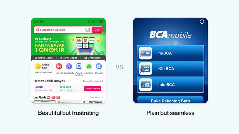
On the other hand, there are also products that look very plain, but their functionality is so seamless that they guide us smoothly toward our goal.
So, which one actually matters more? Aesthetics or functionality? Which should we prioritize? Let’s dive in.
Definition & Differences
Before we go deeper, let’s clarify what we mean by aesthetics and functionality in product design.
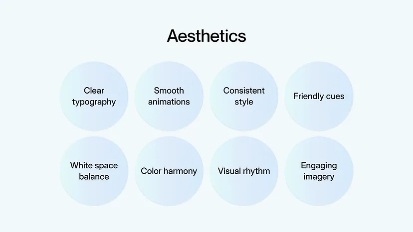
Aesthetically pleasing design is usually characterized by visuals that are neat and pleasant to look at, harmonious color combinations, readable typography, good use of white space, structured layouts, high-quality images, and consistent elements across the product.
All of this makes a product look professional and creates a strong positive first impression.

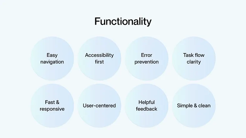
Meanwhile, functional design focuses on how well a product can actually be used. A few key indicators are:
- Usability: an interface that’s easy to understand and helps users achieve their goals.
- Efficiency: allows users to complete tasks quickly and effectively.
- Accessibility: inclusive for users with diverse needs, including those with disabilities.
- Error Prevention: guides users so they don’t easily make mistakes.
- Consistency: clear and predictable patterns that make the overall experience smooth.
Why Both Are Important?
To make this easier to picture, let’s use some real-life analogies. Imagine you find a book with an amazing cover illustration, but the content inside is messy, poorly structured, and hard to follow. You can’t find the information you need. Would you still buy it? Most likely not, because it doesn’t deliver what you were looking for.
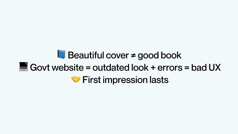
Or think about accessing a government website. The visuals are outdated, the colors and typography don’t build trust, unnecessary images are scattered everywhere, and errors keep showing up. Would you feel like coming back to use it again? Definitely not — the bad first impression already ruined the experience.

It’s the same as meeting someone for the first time: that initial impression shapes how we perceive them, even if they change later on. The same principle applies to product design.
In fact, a study conducted by Masaaki Kurosu and Kaori Kashimura in 1985 found that people tend to believe visually appealing designs are easier to use, even when that’s not actually the case. This proves that aesthetics play a big role in shaping positive, long-term perceptions.
So in the end, aesthetics and functionality are both equally important and inseparable. It’s not about choosing one over the other, but about finding the sweet spot where they complement each other.
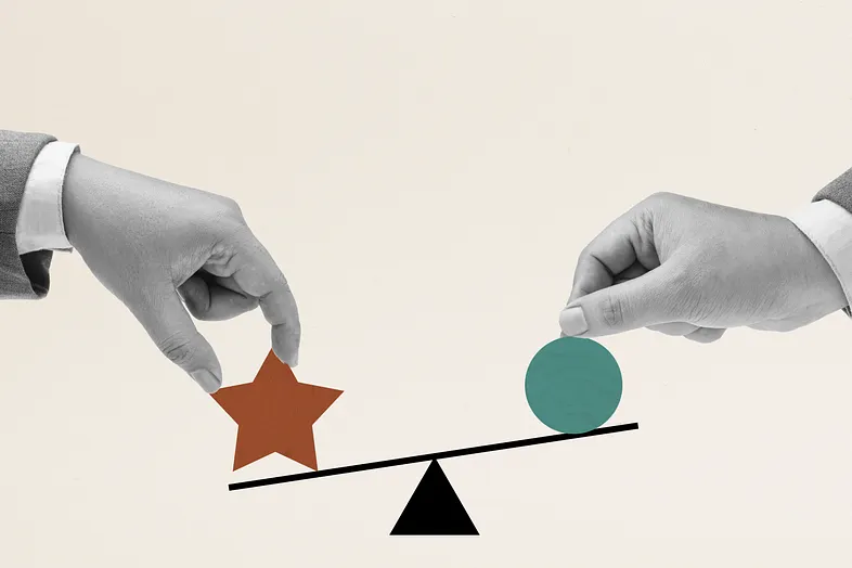
How do we do that? Here are a few ways to do it:
- By understanding human psychology
- Applying solid design principles, and
- Most importantly, aligning with user’s needs
The ultimate goal is simple: to make users feel comfortable and supported while using our product. In other words, put ourselves in their shoes.
But then, how can we know if our product actually meets their expectations? That’s where user testing comes in. Through testing, we can identify what works well, what doesn’t, and what needs improvement.
The challenge is, many design agencies often skip this stage, whether due to budget limitations, time constraints, or tight deadlines.
There are still ways around this:
- Run internal testing to gather insights even with limited resources.
- Use lightweight methods like guerrilla testing, which still provide useful feedback without slowing down the timeline.
Key Takeaways
“People ignore design that ignores people.” — Frank Chimero
At the end of the day, good design is both visually pleasing and easy to use. Aesthetics are important, but they should never come at the cost of functionality. The two should work hand in hand to give your product real value.
That’s why understanding user needs early on is key, so the solutions we create actually hit the mark.
And since design trends will always change, don’t just blindly follow them. Build on timeless principles as your foundation, so your design stays relevant in the long run.
References
- https://tentackles.com/blog/balancing-aesthetics-functionality-ui-ux-designs-golden-rule
- https://uxmag.com/articles/the-aesthetic-usability-effect-why-beautiful-looking-products-are-preferred-over-usable-but-not-beautiful-ones
- https://sis.binus.ac.id/2020/09/21/guerilla-testing/
- https://www.toptal.com/designers/ux/aesthetics-vs-functionality
- https://www.nngroup.com/articles/aesthetic-usability-effect/

Our awards & recognitions.














Ready to discuss your project with us?
Chat with Us