%201%20(1).png)
Choosing the Right Progress Indicator Components
Imagine you’re in this situation:

You opened Netflix and it starts a system update. The screen shows a progress bar circle spinning nonstop for five minutes.
Then, you keep waiting and not knowing how long loading to be completed. After ten minutes, you feel frustration and turn off your Netflix.
Why is the progress indicator important?
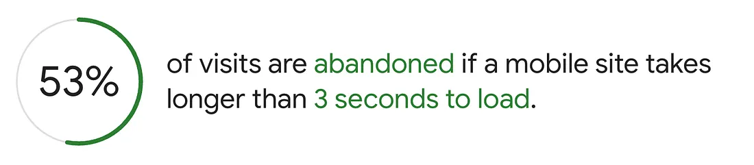
According to data from Google Insights, 3 seconds of loading is a crucial time that makes users decide to wait or exit the app.
We need to provide users with a positive experience during the loading screen and make them wait a little while the system processes are running.
How do we anticipate users leaving the app during the loading?
System feedback is one way to let users know what is happening and prevent them from wondering.
When users take an action such as clicking a button, the system can communicate what process is happening and respond to users by displaying visual feedback like a progress indicator.
Progress indicator
Progress indicators are used as visual information about the status of a task, such as loading or processing to inform the user that the system is processing.
Determinate & Interdeminate
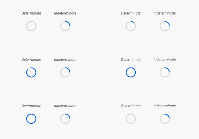
Determine (left) is used to show how long it takes for the system to process and the percentage of completion can be detected.
Indeterminate (right) is used to indicate an undetectable amount of time and doesn’t need to show the user how long the system process will take.
Progress indicator based on processing time.
- Less than 1 second — There is no need to use animations that may distract users.
- Short wait times (1–3 seconds) — Use Interdeminate spinners that don’t distract from the visual focus.
- Medium wait times (3–10 seconds) — Determinate by displaying the progress percentage or how far along the loading is.
- Long wait times (10+ seconds) — At this stage, we need to set expectations for the user. We can use a determinate progress bar by adding additional information such as how long it will take for the task to complete.
Progress indicator implementation
When creating progress indicators, these points need to be considered.
Anatomy
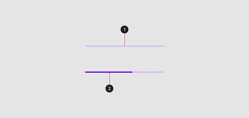
The composition of the progress indicator is divided into two components:
1. Track as a container for how far the progress bar will go.
2. Indicator as a visual marker of how far the current process has progressed.
Don’t do too much
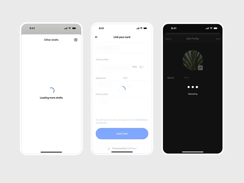
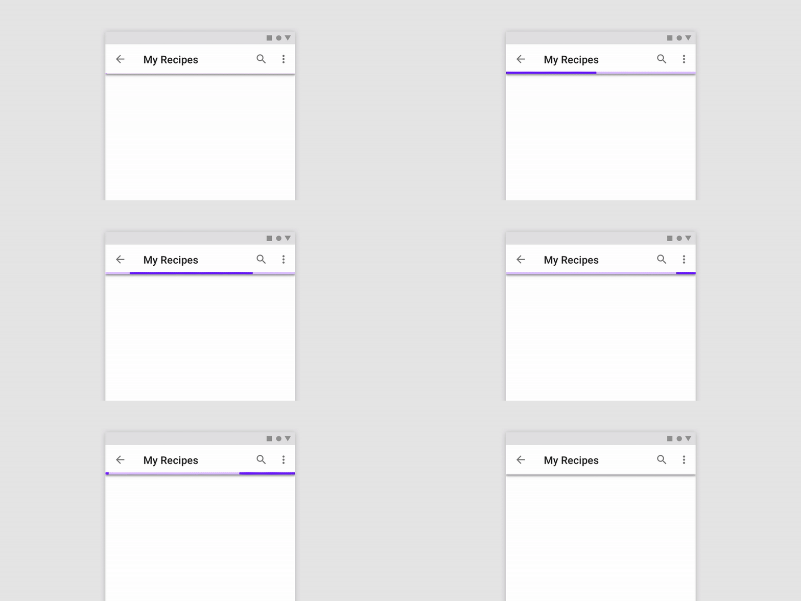
Progress indicators are visual things that don’t draw too much attention, they’re feedback elements that don't distract the user.
We need to imagine ourselves as users who see the same loading animation for 100x in the app.
Maybe seeing it for the first time or twice is okay, but when we see it as regular users and see the same thing 100 times, we will feel uncomfortable.
We need to create a limit that makes animation loading acceptable at any time and not disruptive.
Animation on the progress indicator
Progress indicators use animation to capture attention and inform users of an activity’s progress.
Animations can also be combined with other related components to show specifically which parts are currently processing.
Providing loading time estimates
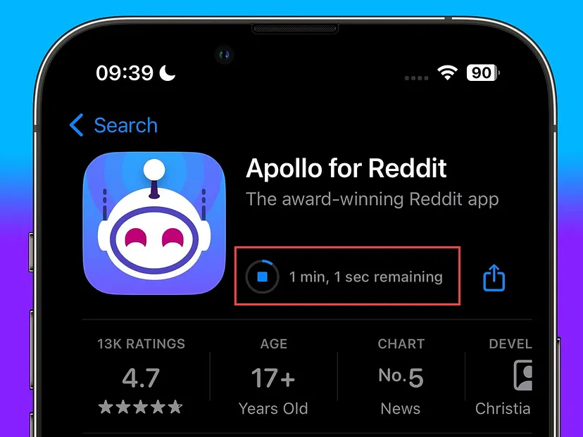
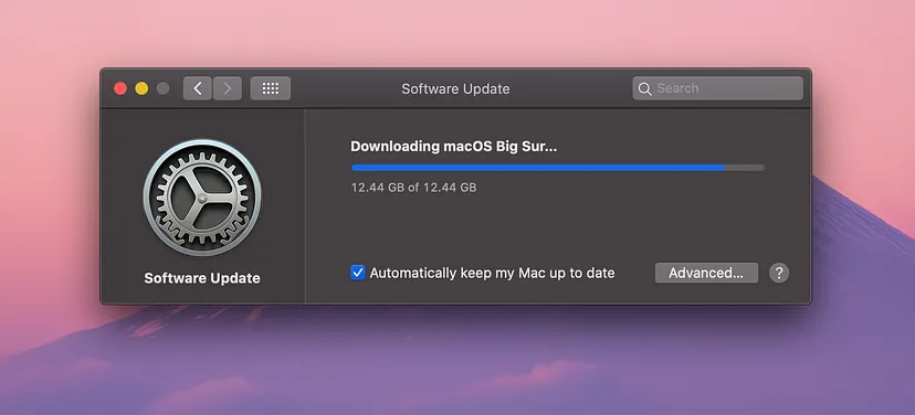
Imagine we are downloading an application with a file size of more than 100MB, which takes more than 20 minutes, and then the system displays a determinate spinner progress bar. We will definitely wait without clear expectations and may become frustrated.
To avoid the above, we can implement a determined component with a progress indicator and an estimated completion time.
That way, users will know how long it will take and can see how far along the download process is or what percentage of the download has been completed.
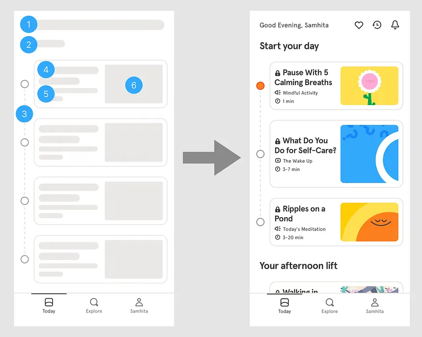
Skeleton screens
We can make progress indicators more engaging for users, for example by using skeleton components.
In the skeleton component, we can display placeholder lines that are the wireframe of the content. The skeleton component is actually a loading animation as well, but it is packaged with a preview of the content that is in the process of loading.
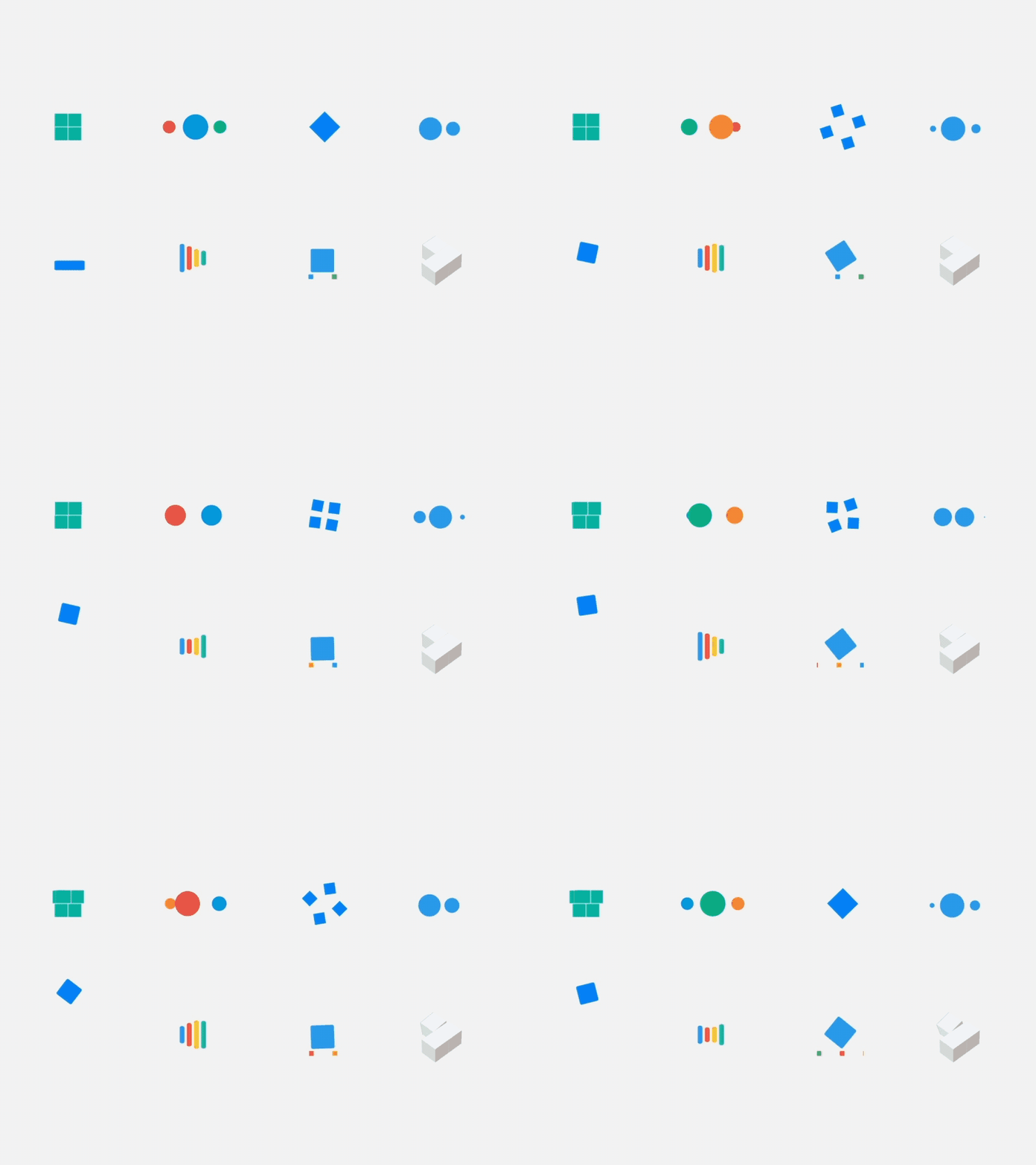
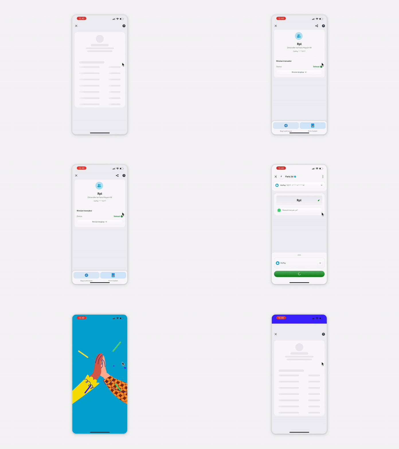
Loading with animated transition
Loading can also be combined with an animated transition logo or illustration to attract users.
We can give the impression that the app is interesting and provides a unique experience.
Learning points
- A progress bar is a component that can provide users with feedback about the system that is currently processing.
- By choosing the right progress bar, we can set clear expectations for users and keep them from feeling like they’re stuck waiting.
References:


Our awards & recognitions.













Ready to discuss your project with us?
Chat with Us