%201%20(1).png)
Designing Interfaces for Busy Users
In the fast-paced digital age, users often interact with interfaces while multitasking, in a hurry, or with limited time. As designers, our challenge is to create experiences that are efficient, intuitive and frictionless.
1. Understand the User’s Context
Users with busy schedules need an efficient and seamless experience. They prioritize speed, convenience, and accessibility in completing tasks.
Users are busy most of the time :
- Using devices on-the-go (mobile)
- Have limited time to complete tasks
- Easily frustrated by unnecessary steps
Solutions :
- Conduct user research (user interviews, analytics) to understand their needs.
- Prioritize core tasks and create faster flows.
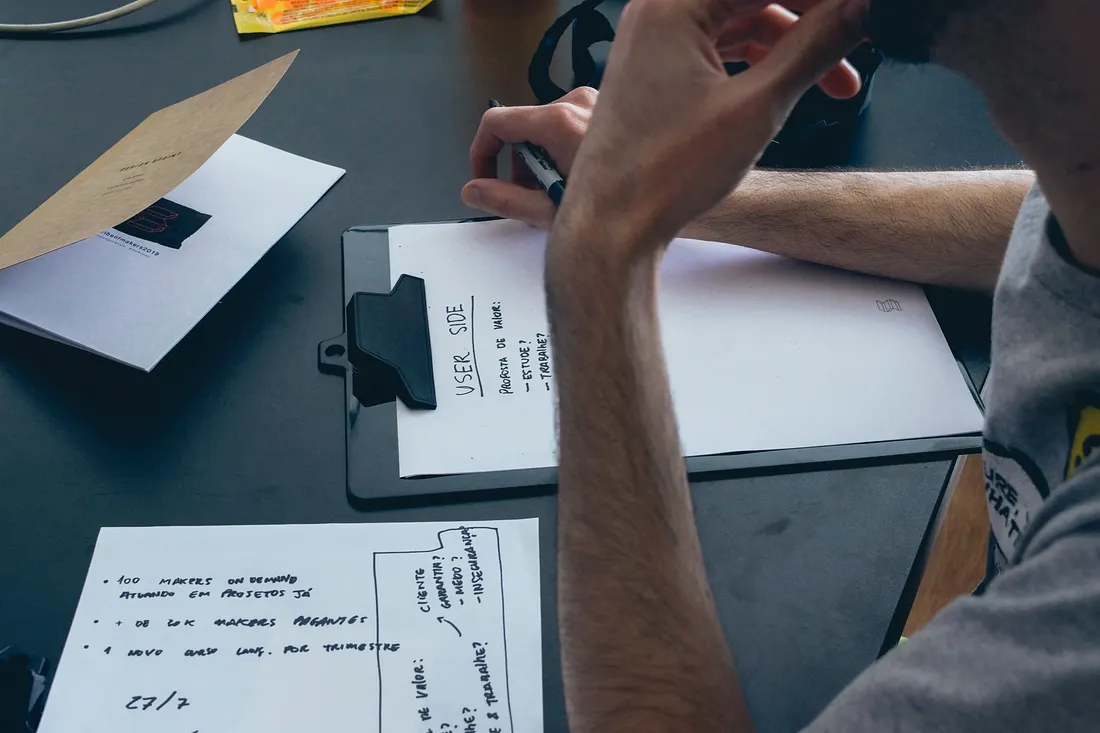
2. Simplify Navigation & Reduce Cognitive Load
The principle of “Less is More” is very important in creating an intuitive and efficient user experience. Too many elements or options in navigation can overwhelm users, making it difficult for them to find the information they need. By simplifying the navigation structure and only displaying elements that are truly relevant, users can focus more on completing tasks quickly without feeling overwhelmed.
Techniques that can be applied :
- Clear hierarchy, use progressive disclosure.
- Consistency — Familiar navigation patterns (e.g. bottom menu in mobile apps).
- Minimize user input, use autofill, default values, or one-click options.

3. Optimize for Speed & Efficiency
Busy users value speed in completing tasks and accessing information. They tend to abandon experiences that are slow, convoluted, or require too many steps. Therefore, every interaction should be designed to reduce waiting time, minimize barriers, and speed up the process.
How to improve efficiency :
- Shortcuts (e.g. gesture swipe, keyboard shortcuts on the web).
- Predictive Actions (example: Gmail’s Smart Reply).
- Skeleton Screens (to reduce perceived loading time).

4. Prioritize Clear Content & Microcopy
Avoid wordy text, but make sure every word has a clear purpose and helps users understand what to do. Proper microcopy can improve user experience by providing clear directions, reducing confusion, and speeding up the decision-making process. Use concise, easy-to-understand, and context-relevant language to ensure users can interact with the system without hindrance or confusion.
Tips :
- Use action-oriented language (e.g. “Continue Payment” vs “OK”).
- Helpful error messages (e.g. “Password must be 8 characters” instead of “Error”)
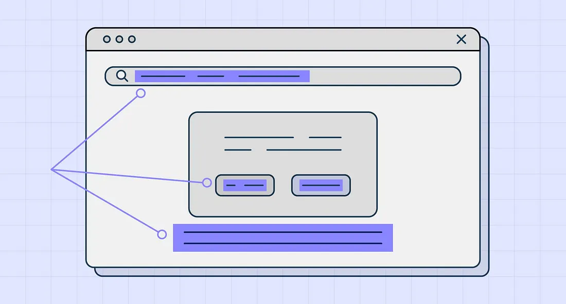
5. Test with Real Users
No design is truly perfect without going through live testing with users. Real-world testing helps identify bottlenecks, understand how users interact with the design, and find areas that need improvement. By testing or collecting direct feedback, the design team can ensure that the solution created is truly effective, easy to use, and fits the user’s needs. This iterative process allows the design to evolve based on real data, not just assumptions.
Testing methods :
- Usability Testing
- A/B Testing
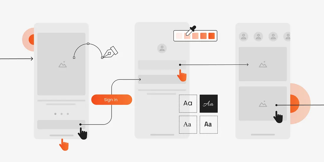
Conclusion
In today’s fast-paced world, users not only want solutions that are visually appealing, but also those that actually help them save time. With a focus on speed, convenience, and efficiency, design should be able to create an intuitive and seamless experience. Good design is not just about aesthetics, but also how we can simplify processes, reduce friction, and ensure that users can complete their flow quickly, comfortably, and without confusion.
“Users should be able to accomplish their intended tasks as easily and directly as possible.” — Jakob Nielsen
Reference
https://lawsofux.com/hicks-law/
https://www.nngroup.com/articles/minimize-cognitive-load/
https://www.nngroup.com/articles/response-times-3-important-limits/


Our awards & recognitions.














Ready to discuss your project with us?
Chat with Us