%201%20(1).png)
When ‘Simple’ Design Is Actually Hard

You spend weeks designing a landing page. The layout feels balanced, the visuals are polished, and every section seems to have a reason to exist. Then someone says, “Can we make it simpler?”
You start removing sections. The page looks cleaner, but something feels off. The story loses its flow, the hierarchy weakens, and what once felt complete now feels fragile. That’s usually the moment when “simple” stops feeling simple.

In UI/UX, simple design is often perceived as something easy to create. Fewer elements, a clean layout, and a straightforward flow. However, in practice, this kind of design is often the most challenging to achieve.
The simpler an interface looks, the more responsibility each decision carries. There is nowhere for mistakes to hide. Every element must have a clear purpose.
This article explores why simple design often feels hard — and what approaches can help us handle it.
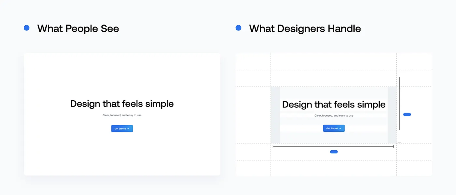
What Do We Actually Mean by “Simple”?
Simple does not mean minimal effort or minimal exploration. In the context of UI/UX, simple usually means:
- Easy to understand at first glance
- Focused on the user’s main goal
- Free from unnecessary cognitive load
A design that feels simple to users is often the result of complex thinking behind the scenes.
Why Does Simple Design Feel Hard?
1. Too Many Things Feel Important

On a single screen, almost every piece of information has a reason to exist. Each feature, metric, or message feels relevant. The challenge begins when everything wants equal priority.
Without clear prioritization, the interface quickly becomes crowded and loses focus.
2. Removing Is Harder Than Adding
Adding elements often feels safe. Removing them feels risky.
We worry:
- “What if users need this?”
- “What if the information feels incomplete?”
- “What if it looks too empty?”
Yet, in many cases, removing elements is exactly what brings clarity to the experience.
3. Simplicity Makes Mistakes More Visible

In complex designs, mistakes can hide behind layers of content. In simple designs, every decision
is exposed.
A weak hierarchy, unclear wording, or poor placement is immediately noticeable to users.
A Simple Design Isn’t Always Obvious
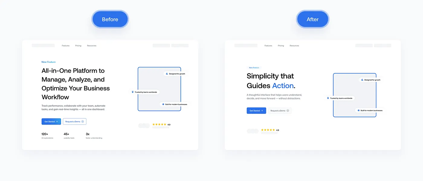
Simple design is often described in visual terms: fewer sections, more whitespace, and cleaner layouts. But in practice, simplicity is rarely just about how much we remove — it’s about what remains and why it stays.
Below is a simple before-and-after example of a landing page. The goal didn’t change. The audience didn’t change. Only the decisions did.
In the “before” version, the page tries to explain everything at once. Each section feels reasonable on its own, but together they compete for attention. Nothing is technically wrong — yet the message feels diluted.



Our awards & recognitions.














Ready to discuss your project with us?
Chat with Us